
The Design Principle of Contrast: A Complete Guide (With Real LinkedIn Examples)
Open LinkedIn right now and scroll for thirty seconds. Count how many posts your eye actually stops on, not scrolls past, actually stops on.
For most people, it's two or three out of forty. Every other post gets a half-second glance before the thumb keeps moving, and that's true even when the post underneath that glance had something genuinely worth reading.
The idea rarely explains the difference. The graphic does. Specifically, whether the graphic used contrast well enough to interrupt a thumb that was already moving.
This guide covers contrast in more depth than most design explainers bother to, on purpose. That means what it actually is, why your visual system responds to it before you've consciously registered anything, what counts as good contrast versus decoration, the accessibility ratios almost nobody mentions, the mistakes that quietly kill otherwise decent graphics, and how to apply all of it specifically to LinkedIn, where the format and the audience both behave differently than they do anywhere else.
What Contrast Actually Means in Design
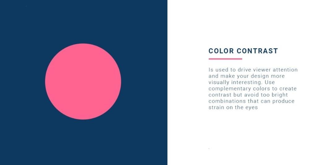
Contrast is the deliberate difference between two or more elements on a page or screen. Big against small. Dark against light. Bold against thin. Dense against open. A sharp edge against a round one.
The operative word is "deliberate." Random difference doesn't count, no matter how different the elements end up looking. A headline set only slightly larger than the paragraph underneath it usually reads as a formatting slip rather than a real signal, and the eye has no clear instruction about where to land first.
Contrast is one of four core principles most design education still teaches together: contrast, repetition, alignment, and proximity, a framework popularized by Robin Williams in her long-running book "The Non-Designer's Design Book." Of the four, contrast does something the other three can't. It decides whether a viewer looks at the page long enough for repetition, alignment, or proximity to matter at all.
Where the Idea Actually Comes From
The response contrast triggers predates graphic design by a long way, and it's worth knowing where it actually comes from.
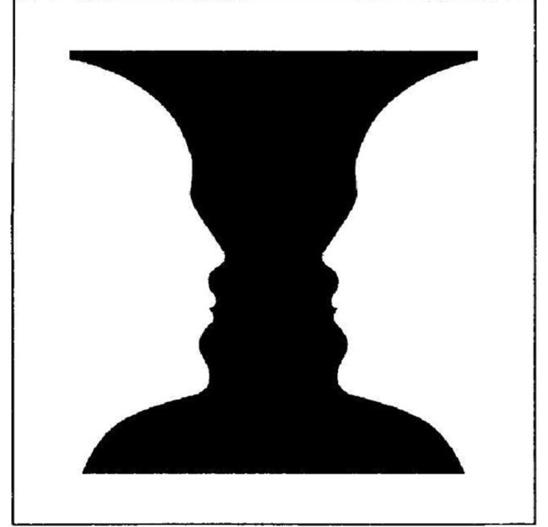
Psychologists studying visual perception in the early twentieth century, working in what became known as the Gestalt tradition, described something called figure-ground perception: the automatic way a viewer's brain separates an object (the figure) from its surroundings (the ground). The classic illustration, known as Rubin's vase, is a black silhouette that reads as either a vase or two faces in profile, depending on which part of the image the brain treats as the figure at any given moment. What makes either reading "pop" is contrast between the shape and its background. Remove that contrast and the image collapses into a flat gray field with no figure left to find.
The design world simply learned to trigger a response that already existed, deliberately and on demand.
Why Your Brain Can't Ignore Contrast
There's a more specific, and more useful, explanation than "contrast looks nice." Vision scientists call it preattentive processing.
Preattentive attributes are visual properties your brain registers in roughly 200 milliseconds, well before conscious attention gets involved. Researcher Colin Ware, whose work on visual perception is foundational in the data visualization field, groups these attributes into a small set of categories, with color, size, orientation, and motion among the most reliable. A red dot in a field of gray dots doesn't require any searching. It registers instantly, before anyone has consciously decided to look for it.
This matters for a very practical reason. On a LinkedIn feed, nobody is reading a graphic attentively before deciding whether to stop. That decision happens preattentively, in a fraction of a second, based on whether something in the graphic triggers one of those categories: a color that jumps, a size that's disproportionate, a shape that breaks a pattern.
Design taste can get you a graphic that looks nice once someone is already looking at it. Contrast is what gets them to look in the first place.

Why Contrast Matters More on LinkedIn Than Almost Any Other Platform
Every platform has different reading conditions, and LinkedIn's are unusually unforgiving toward a graphic that skips contrast.
The scrolling itself is fast and one-handed, often squeezed into a commute or a gap between meetings. The graphic renders at a shrunk preview size before anyone taps to expand it, so whatever hierarchy existed at full resolution has to survive that shrink or it disappears. LinkedIn's audience, more than most, has also learned to recognize a templated look. A graphic where every element carries identical visual weight (same headline size, same text weight, one shade of blue reused everywhere) reads as generic before a single word gets processed, because it looks like the hundreds of other posts built from the same free template that week.
Strong, deliberate contrast counters all three problems at once. It survives the shrink because the size or color difference is still visible small. It signals intentional design rather than a template default. And it does the preattentive work described above, catching the eye before the scroll finishes.
The Eight Levers of Contrast
Most people, asked how to add contrast to a design, think of exactly one lever: color. Color is the most visible lever, but it's one of eight, and graphics that only use one or two of them tend to look flatter than the person who made them intended.
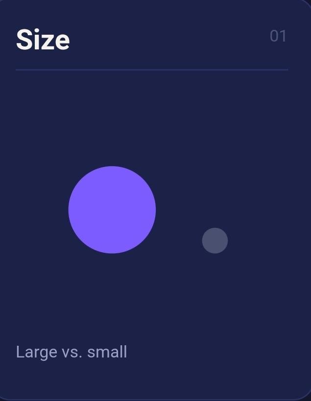
1. Size
Large elements set against small ones. A large percentage figure, say "68%," sitting next to a small caption line explaining what it measures, is one of the fastest ways to establish what a graphic is actually about.
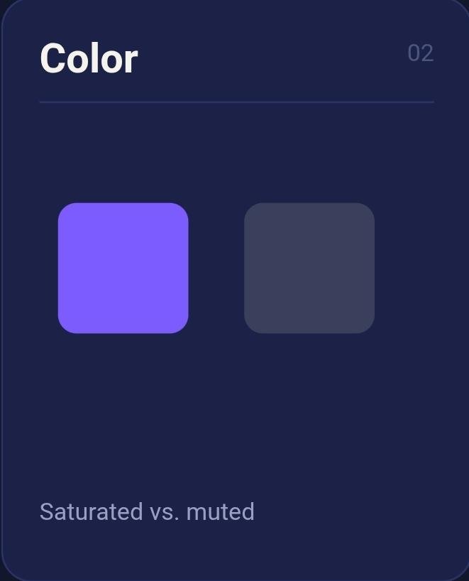
2. Color
Saturated or distinct hues set against muted or neutral ones. Reserving a single accent color for the headline, or the one number that matters, and using it nowhere else on the slide keeps that hue meaningful instead of decorative.
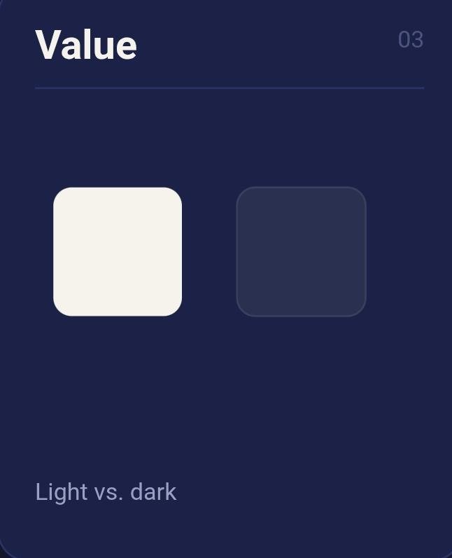
3. Value
Contrast in lightness, independent of hue. A dark navy background behind a bright white callout box creates a strong jump even if no other color changes. Grayscale can carry a full hierarchy through value alone.
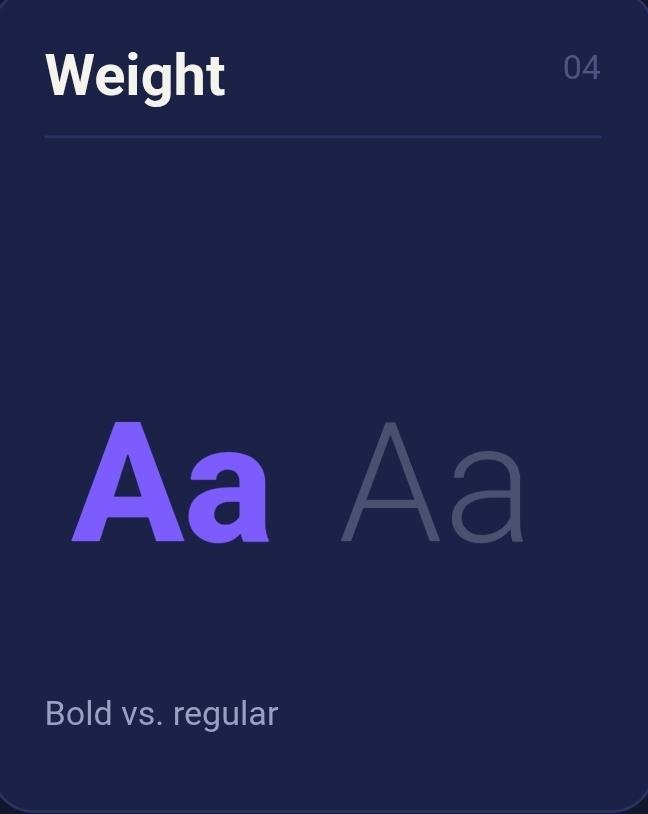
4. Weight
Bold text set against regular or light text. A single bold takeaway line underneath two or three lines of regular-weight explanation tells the eye exactly which sentence is the point and which sentences are support.
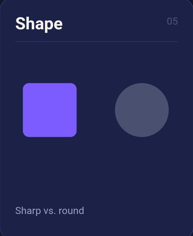
5. Shape
Sharp edges against round ones, or a single shape breaking an otherwise repeating pattern. One circular icon inside a grid of square ones does more to mark "this is the important one" than a caption ever could.
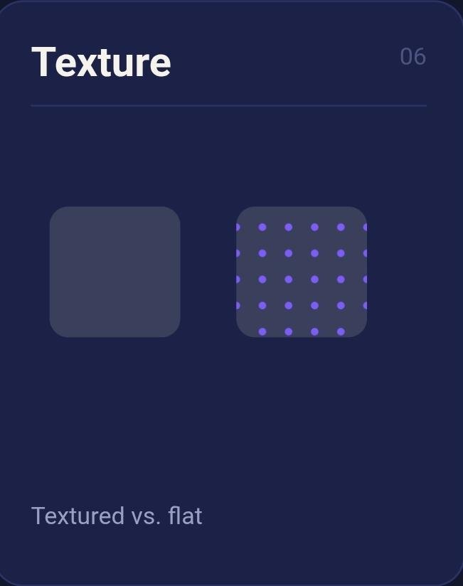
6. Texture
Less common in flat digital graphics, but still real. A photographic background behind clean vector icons and text, or a subtle grain layered behind an otherwise flat color block, creates a tactile contrast that reads as intentional rather than default.
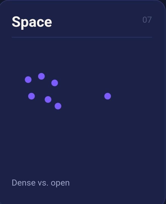
7. Space
Dense, text-packed sections set against open, empty ones. A single quote left alone on an otherwise empty slide, surrounded by generous margin, reads as more important than the same quote crammed between two paragraphs, purely because of the space around it.
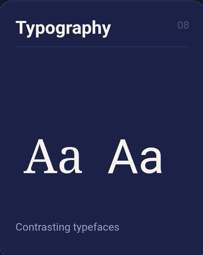
8. Typography pairing
A contrast in typeface character, not just size or weight. Pairing a bold, geometric sans-serif headline with a lighter serif or a handwritten-style accent for a quote creates a tonal difference that a single typeface, however well-sized, can't produce alone.
| Lever | The Pairing |
|---|---|
| Size | Large vs. small |
| Color | Saturated vs. muted |
| Value | Light vs. dark |
| Weight | Bold vs. regular |
| Shape | Sharp vs. round |
| Texture | Textured vs. flat |
| Space | Dense vs. open |
| Typography | Contrasting typefaces |
None of these eight need to be extreme to register. A headline set two sizes larger than the body copy, using the brand's one accent color and nothing else, is often enough on its own. The mistake most people make is assuming contrast has to be loud to work. Clear holds up just as well, and it survives a feed full of louder competitors better than loud does.
Contrast and Accessibility: What WCAG Actually Requires
Most articles on this topic mention accessibility in passing and move on. It deserves more than a sentence, because a graphic can look intentional and still fail the people trying to read it.
The Web Content Accessibility Guidelines (WCAG) set specific numeric contrast ratios between text and its background, on a scale from 1:1 (no contrast at all, like white text on white) up to 21:1 (pure black on pure white). For Level AA, the widely used baseline standard, normal body text needs a ratio of at least 4.5:1 against its background.
Large text, defined as roughly 24px regular weight or 19px bold and up, gets a lower bar of 3:1, since bigger letterforms stay legible at lower contrast. Level AAA, a stricter standard, raises those numbers to 7:1 and 4.5:1.
In practice, this rules out a lot of on-trend color pairings. Light gray text on white, pastel on pastel, or a mid-tone color against a similarly mid-tone background can look stylish in isolation and fail the ratio badly once measured. Free contrast checker tools exist specifically to test hex codes against each other before committing to a palette.
The bigger point: Accessibility and design taste aren't in conflict here. A ratio that clears WCAG AA is, in almost every case, also the ratio that reads clearly on a shrunk LinkedIn thumbnail on someone's phone. The same math that helps a low-vision reader also helps a fully sighted one scrolling too fast to focus properly.

Where Most People Get Contrast Wrong
The most frequent mistake is emphasis landing in the wrong place on the page, rather than too little contrast overall.
Someone bolds every third phrase in a caption because it feels more readable, and ends up with a design where nothing is emphasized, since everything technically is. Ten elements shouting at once has roughly the same effect as none of them shouting at all.
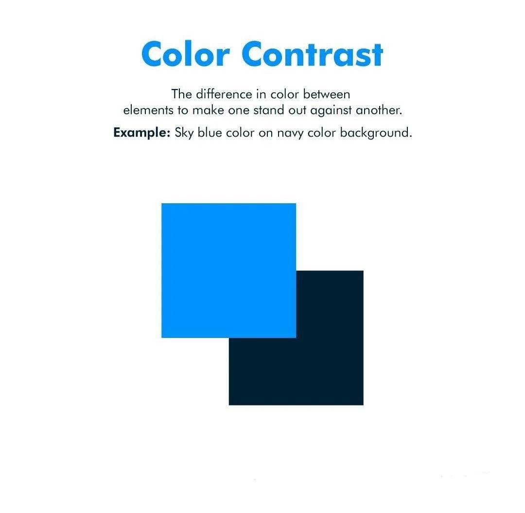
A close second: two colors that are different but equally loud. A bright orange headline over a saturated blue background creates visual noise instead of hierarchy, because both hues compete for the same amount of attention. Working contrast usually needs one quiet side and one loud side. When everything registers as loud, the eye has nowhere to land first.
Then there's the mistake that looks safest from the outside: sameness dressed up as brand consistency. Every slide in a carousel uses an identical font size, identical spacing, and an identical layout, because it feels clean and on-brand. It is clean. It's also forgettable, because the eye slides across five nearly identical slides without a single moment that says stop here, this part matters.
A subtler version shows up in data-heavy graphics: charting five values in five different bright colors, when only one of those values is the actual point being made. Every color pulls equal weight, so none of them lead. A single accent color on the value that matters, with the other four rendered in neutral gray, fixes this in about thirty seconds and changes the entire read of the graphic.
Consistency and contrast get treated as opposites constantly, though they aren't really in tension. The brand elements (colors, fonts, tone) stay fixed. The emphasis inside that fixed system still needs freedom to shift from slide to slide and post to post, or the whole feed starts to read as one long, flat note.
How to Apply Contrast by LinkedIn Format
A comparison table needs different contrast decisions than a single quote graphic. Breaking it down by format makes this concrete.
- ■Single-image stat posts. One number should dominate the frame, usually through size and weight together, with everything else (label, source, context) rendered small and quiet. Resist bolding the supporting text too. If the number and the caption carry equal weight, neither one wins.
- ■Carousels. Contrast has to work at two levels: within each slide, and across the sequence. A cover slide with heavy contrast (bold headline, generous space) followed by data-dense inside slides with lighter internal contrast creates a rhythm: open strong, settle into detail, then close on a slide where contrast returns for the takeaway.
- ■Quote graphics. Space usually does the heavy lifting here, more than color. A short quote centered in a large, empty frame, set in a slightly different typeface than the rest of the brand system, reads as considered rather than a caption pasted into a template.
- ■Comparison graphics (a versus table, a before-and-after). Value and color carry these. Give the "better" or recommended side the brand's accent color and a bolder treatment; keep the other side in neutral gray, so the graphic doesn't imply false equivalence between two options that aren't actually equal in the argument being made.
- ■Process or framework graphics. Shape and weight combine well here. Use a repeating shape (numbered circles, arrows, boxes) for each step, then break the pattern once, larger or in the accent color, to mark the step that matters most or the current stage in a sequence.
A Quick Way to Test Your Own Graphic
Before posting, shrink the graphic down to thumbnail size, or squint at it from across the room.
The one thing meant to be noticed first should still be the thing that jumps out. If the eye lands on the logo, the background pattern, or nowhere in particular, the hierarchy isn't there yet.
A faster version of the same test: show it to someone for two seconds, then ask what they remember. If they can't name the one number or the one line that mattered, the contrast needs another pass, regardless of how good that line reads on its own.
A more technical option: run the two main colors through a free contrast checker and confirm the ratio clears 4.5:1 for body text, or 3:1 for a large headline. A design can pass the squint test and still fail this one, if the palette is close in value even though the hues differ.
Frequently Asked Questions
Where Visly Fits Into This
Knowing all eight levers is one thing. Applying the right combination correctly, on every single post, while also writing the caption and picking the stat and getting the thing published before the idea goes cold, is a different problem entirely.
Visly builds contrast into every graphic by default, using the same levers covered above. Set a headline, and Visly sizes and weights it to stand apart from supporting text automatically. Add a stat, and it gets the size and value contrast a number needs to register in under a second, without testing font sizes and spacing by trial and error. Brand colors stay locked in, since they're set once, while the emphasis itself still shifts appropriately from graphic to graphic, because Visly reads which piece of each post needs to lead and which pieces are support, the same read a trained design eye would make.
The accessibility side works the same way. Contrast ratios between text and background stay within range automatically, so a graphic that looks good also reads clearly for the widest possible audience, without anyone needing to run a manual ratio check before posting.
That's the real value of getting all eight levers right without spending years learning graphic design first. Nobody posting several times a week has time to run a contrast checker and squint-test every graphic before it goes up, and nobody should have to, just to get something people actually stop on.
The Short Version
- ■Contrast is the deliberate difference between elements on a page, built so the eye knows where to look first, second, and third.
- ■It works because of preattentive processing: the brain registers certain visual differences in about 200 milliseconds, before conscious attention engages at all.
- ■There are eight real levers: size, color, value, weight, shape, texture, space, and typography. Most flat-looking graphics are only using one or two of them.
- ■Accessibility isn't separate from good design here. A ratio that meets WCAG AA (4.5:1 for body text, 3:1 for large text) tends to be exactly the ratio that survives a shrunk thumbnail on a phone.
- ■The most common mistake is emphasis in the wrong place: everything loud, or everything the same, dressed up as brand consistency.
- ■Get the hierarchy right, and the idea underneath it finally gets a fair read.