
Color Wheel: The Complete Guide to Color Theory, Color Combinations & Palettes
Choosing colors sounds easy… until you actually have to choose them.
You pick a blue you like. Then you need a second color.
Should it be orange? Green? Purple? A darker blue? Maybe beige?
Then you add the colors to your design and somehow the palette that looked perfect as five little squares now looks terrible on an actual website.
That is where the color wheel becomes useful.
A color wheel gives you a visual map of how colors relate to one another. It can help you find complementary colors, build harmonious palettes, understand warm and cool colors, create tints and shades, and make better decisions about color in everything from branding and websites to presentations and social media graphics.
But there is an important distinction: the color wheel can suggest relationships between colors. It cannot tell you whether a palette will automatically make a good design.
Good color choices also depend on contrast, saturation, lightness, hierarchy, context, accessibility, and how much visual weight you give each color.
This guide explains all of it.
What Is a Color Wheel?
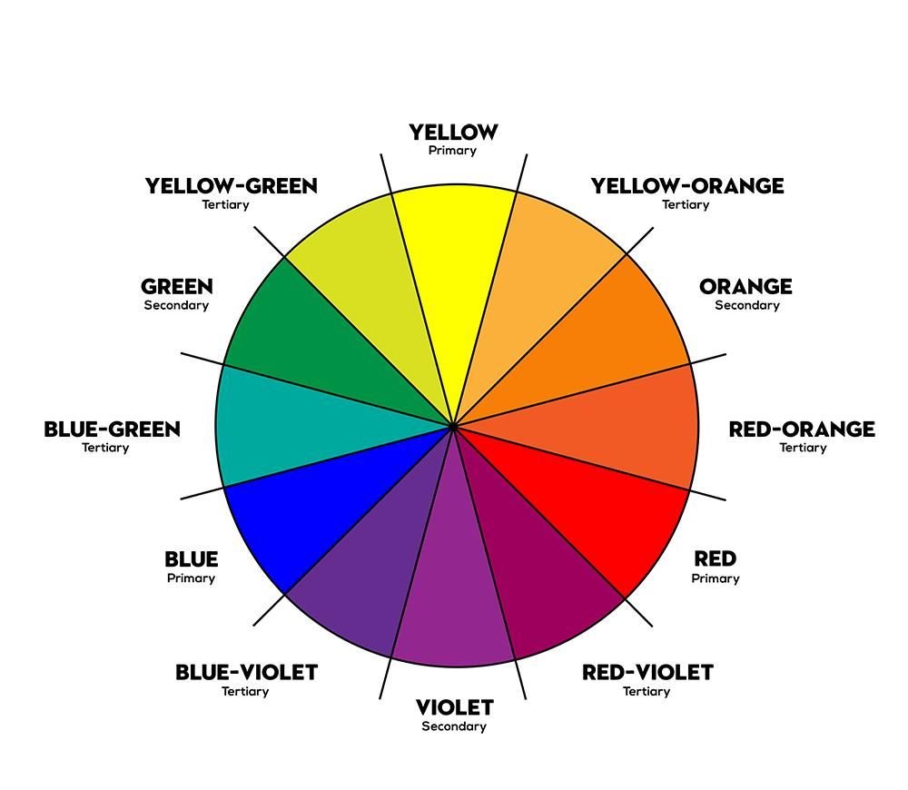
A color wheel is a circular arrangement of colors that shows the relationships between different hues.
Designers, artists and other creatives use it to understand which colors are related, which colors contrast strongly, and which combinations can create a particular visual effect.
The modern color wheel is rooted in the history of color theory and Isaac Newton's work with the visible spectrum in the 17th century. Today, different color models are used for different purposes, including RYB for traditional art and RGB for digital screens.
The simplest way to think about a color wheel is as a map.
Instead of guessing whether two colors will work together, you can look at where they sit relative to each other.
- ■Colors opposite each other create complementary relationships.
- ■Colors beside each other create analogous relationships.
- ■Colors evenly spaced around the wheel create triadic relationships.
- ■A single hue with different lightness and saturation creates a monochromatic palette.
The wheel gives you the relationship. Your design decides how to use it.
RGB vs. RYB: Which Color Wheel Should You Use?
This is one of the first things to understand because there isn't just one color wheel for every medium.
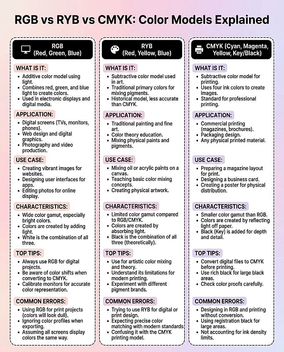
Two color models you'll commonly encounter are RYB and RGB.
RYB: Red, Yellow, Blue
RYB is the traditional color model taught in art and painting.
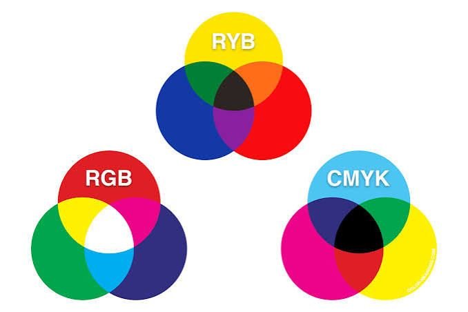
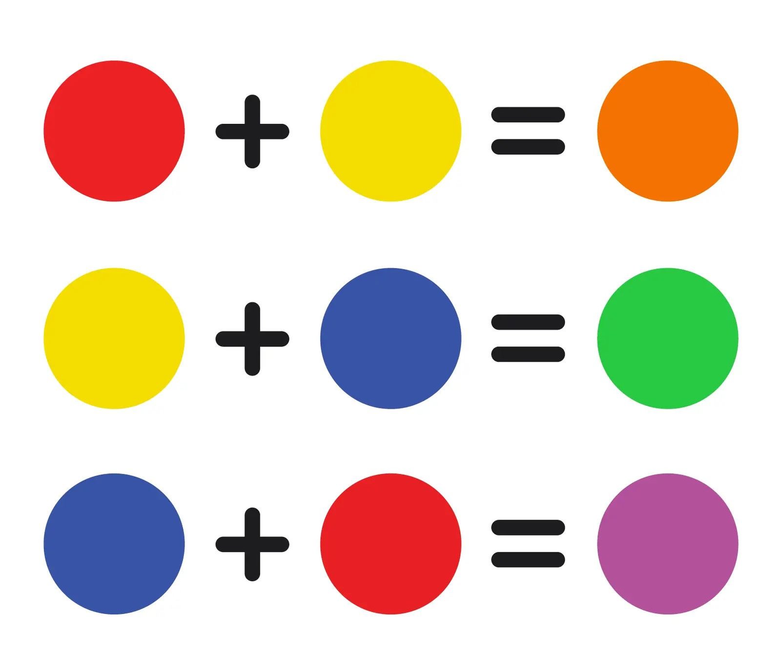
Its primary colors are red, yellow and blue. Mixing these creates the traditional secondary colors:
- ■Red + Yellow = Orange
- ■Yellow + Blue = Green
- ■Blue + Red = Purple
This model is useful when you're thinking about physical pigments, paints and traditional art.
RGB: Red, Green, Blue
RGB stands for red, green and blue. It is an additive color model used for digital displays.
Screens create colors by combining different amounts of red, green and blue light. In the RGB model, the primary colors combine to produce secondary colors such as cyan, magenta and yellow.
That makes RGB especially relevant when you're designing:
- ■Websites
- ■Apps
- ■Social media graphics
- ■Digital advertisements
- ■Presentations
- ■Digital illustrations
- ■UI designs
So which one should you use?
If you're mixing paint, RYB is the more familiar traditional model. If you're designing something that will primarily appear on a screen, RGB is the more relevant model. And if you're preparing work for professional printing, you'll also encounter CMYK, which uses cyan, magenta, yellow and black.
The 12 Colors of the Color Wheel
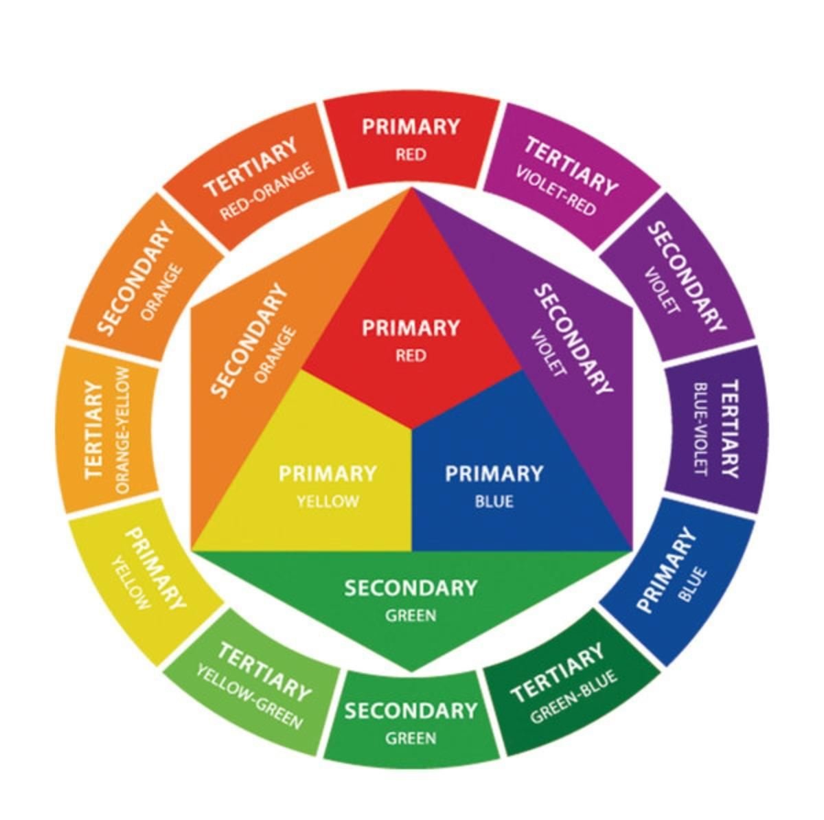
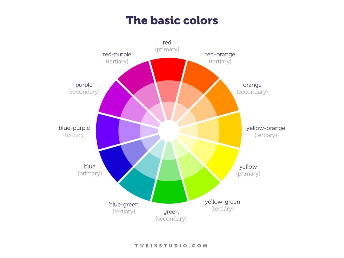
A basic color wheel can be divided into primary, secondary and tertiary colors.
Primary Colors
Primary colors are the starting points of a color model. In the traditional RYB model: red, yellow and blue. In RGB: red, green and blue. The exact definition of "primary" therefore depends on the color system you're using.
Secondary Colors
Secondary colors are created by combining primary colors.
In the traditional RYB model: red + yellow = orange, yellow + blue = green, blue + red = purple.
In RGB: red + green = yellow, green + blue = cyan, blue + red = magenta.
Tertiary Colors
Tertiary colors sit between primary and secondary colors. Examples include red-orange, yellow-orange, yellow-green, blue-green, blue-purple and red-purple.
These in-between colors are extremely useful when creating more sophisticated palettes because they give you more control than simply choosing one of six major colors.
What Are Color Harmonies?
A color harmony is a relationship between colors that can be used to create a visually coherent palette.
Think of color harmony as a starting framework, not a strict design rule.
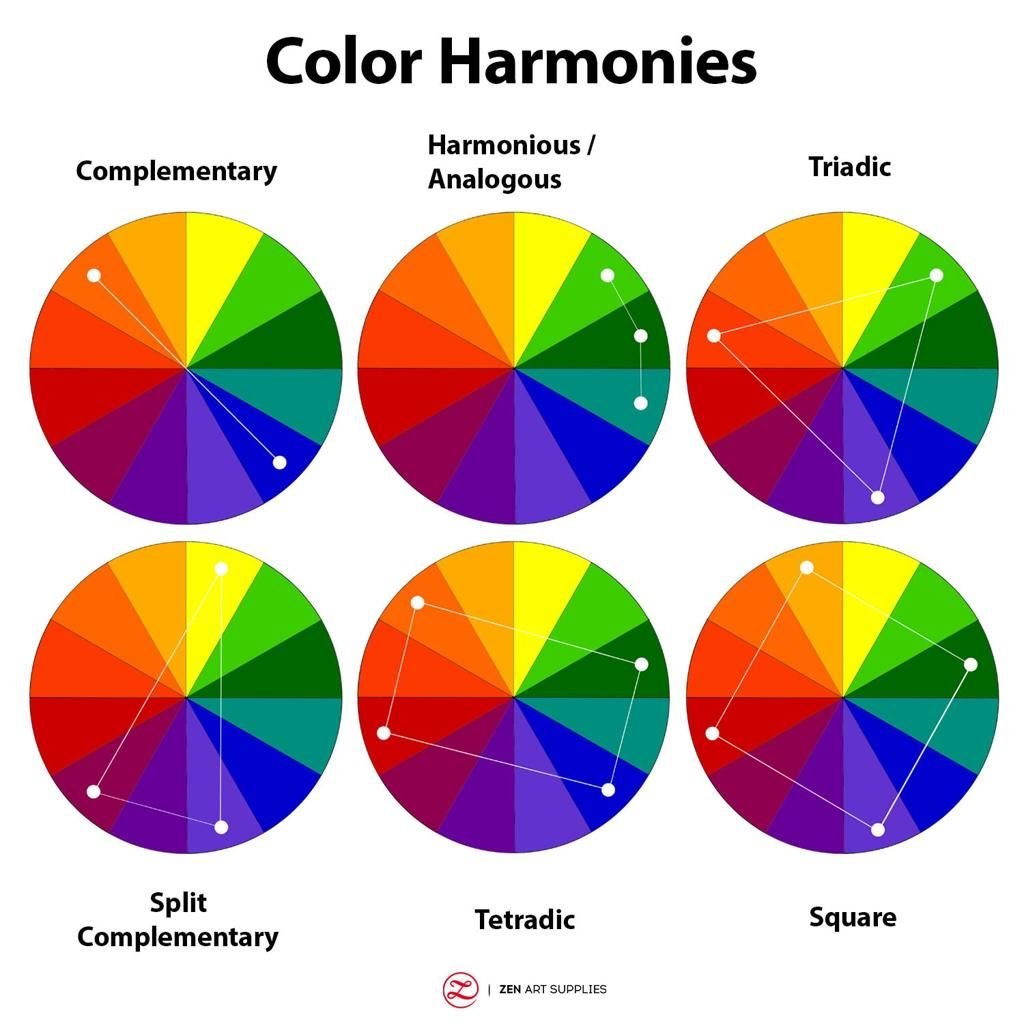
The most common color harmonies include monochromatic, analogous, complementary, split-complementary, triadic and tetradic.
1. Monochromatic Color Schemes
A monochromatic color scheme starts with one hue and uses variations of that hue. You create those variations by changing properties such as lightness and saturation.
For example, a blue palette might contain deep blue (#123B66), medium blue (#2563A6), blue (#3B82F6), light blue (#93C5FD) and very light blue (#DBEAFE). Everything still feels like blue. The difference comes from how light, dark, muted or intense each version is.
Why monochromatic palettes work
They are usually easy to keep visually consistent because you're working within one color family. They can be useful for corporate websites, SaaS interfaces, presentations, minimalist branding, editorial designs, background systems and UI components.
The problem with monochromatic palettes
They can become boring. If every element has almost the same visual weight, nothing stands out.
The solution is to create stronger differences in lightness, saturation, size, spacing, typography and texture. A monochromatic palette does not mean every element should look equally blue.
Example

2. Analogous Color Schemes
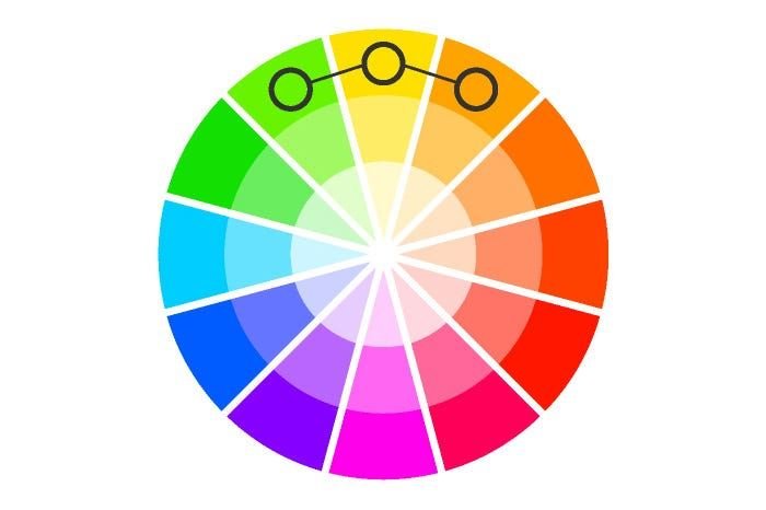
Analogous colors sit next to each other on the color wheel. For example: yellow → yellow-green → green, or blue → blue-purple → purple.
Because these colors are close together, they tend to create a more unified visual experience. Analogous palettes can work especially well when you want a design to feel cohesive rather than highly contrasting.
They can work well for nature-inspired brands, wellness designs, illustrations, editorial graphics, soft landing pages, background gradients and calm visual identities.
The biggest mistake with analogous colors
Using every color at equal strength. Imagine a design using bright yellow, bright green, bright cyan and bright blue all at full saturation. The colors may technically have a harmonious relationship, but the design can still become exhausting.
A better approach is to choose one dominant color, one supporting color and one accent. This creates hierarchy.
Example
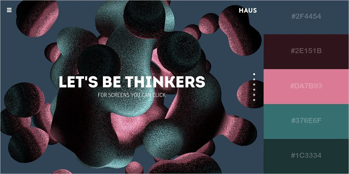
3. Complementary Color Schemes
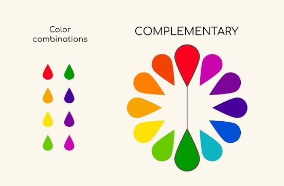
Complementary colors sit opposite each other on the color wheel. Common examples include blue + orange, red + green, yellow + purple and cyan + red.
Complementary palettes create strong contrast. That can make elements appear more noticeable and energetic.
But there is a catch: high contrast does not mean you should use both colors everywhere.
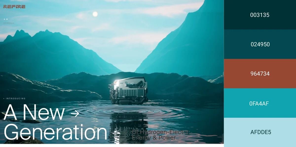
If you put a fully saturated blue next to a fully saturated orange and cover half the page with each, the result can become visually aggressive. Instead, use one color as the dominant color and the complementary color as an accent. For example: 80–90% deep blue with 10–20% orange accents.
The orange can then be used for buttons, links, icons, highlights, important numbers and small visual details. The contrast makes those elements stand out.
Example
4. Split-Complementary Color Schemes
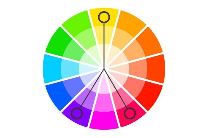
Split-complementary palettes are similar to complementary palettes, but instead of choosing the exact opposite color, you choose the two colors sitting next to the opposite. For example: blue paired with yellow-orange + red-orange.
The result gives you strong contrast without relying on just two opposing hues. This can be useful when you want a palette that feels colorful and energetic but gives you more flexibility than a simple complementary scheme.
Try them for marketing graphics, posters, illustrations, playful brands, social media designs and event graphics. They are especially useful when two colors feel too limiting but four or five colors feel excessive.
Example

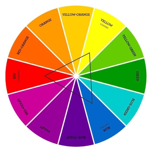
5. Triadic Color Schemes
A triadic color scheme uses three colors spaced evenly around the color wheel. Imagine drawing an equilateral triangle inside the wheel. Each corner lands on one of the three colors.
A classic example is red + yellow + blue. In a digital RGB context, the exact hues will depend on the color model and wheel being used.
Triadic palettes can create strong visual contrast while giving you more variety than a complementary palette.
The danger of triadic palettes
Three bright colors can quickly turn into visual chaos. The easiest way to control a triadic palette is to assign different roles. For example: primary 60%, secondary 30%, accent 10%.
The exact percentages don't have to be mathematically perfect. The principle matters more: one color should usually do most of the visual work.
Example

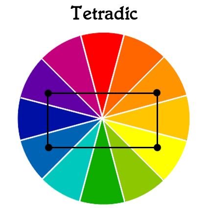
6. Tetradic Color Schemes
Tetradic color schemes use four colors arranged as two complementary pairs.
They give you a lot of flexibility. They also give you a lot of opportunities to make a terrible design. Four colors can quickly compete for attention. That's why tetradic palettes usually need stronger hierarchy than simpler schemes.
Instead of thinking "I have four colors, so I should use all four equally," think "I have four colors available. Which one should dominate?"
For example: primary dark purple, secondary muted yellow, supporting pink, accent green. The last two may appear only in small areas. The result feels colorful without looking like every color is fighting for the user's attention.
Example
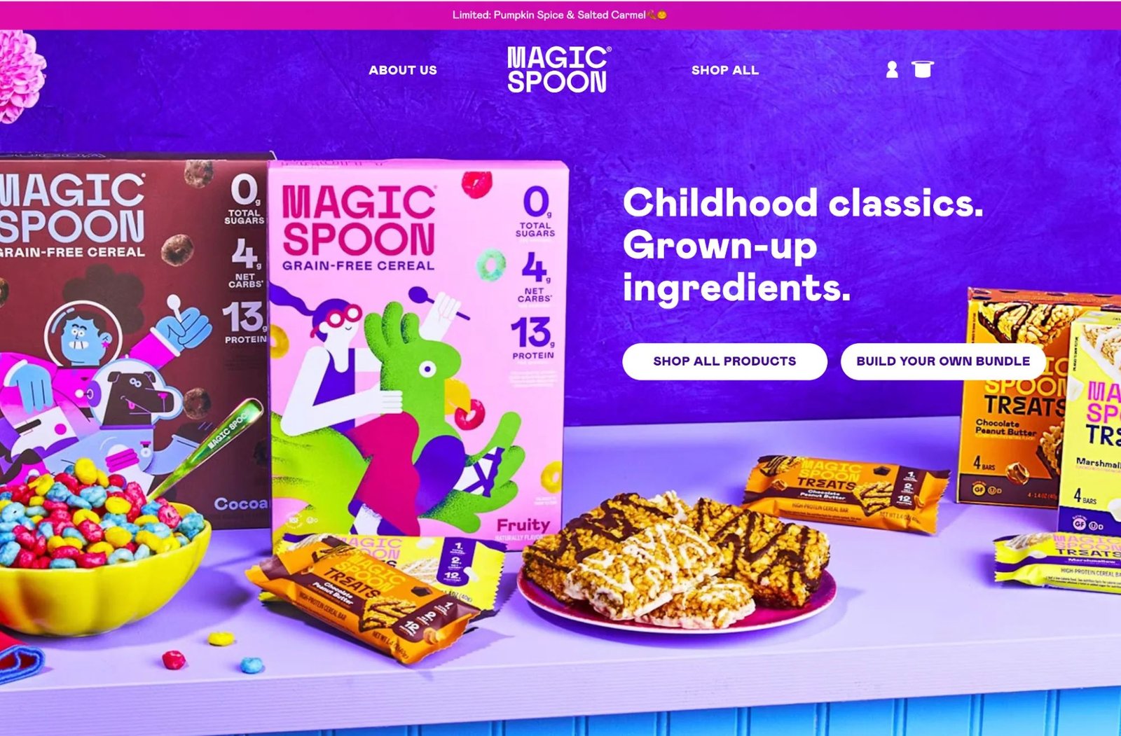
Color Harmony Cheat Sheet
If you're unsure where to start, use this:
| You want the design to feel... | Try |
|---|---|
| Simple and controlled | Monochromatic |
| Cohesive and smooth | Analogous |
| Bold and high-contrast | Complementary |
| Contrasting but flexible | Split-complementary |
| Vibrant and playful | Triadic |
| Complex and colorful | Tetradic |
Remember: the harmony tells you which colors can work together. It does not tell you how much of each color to use. That part is design.
Hue, Saturation and Lightness: The Three Things You Need to Understand
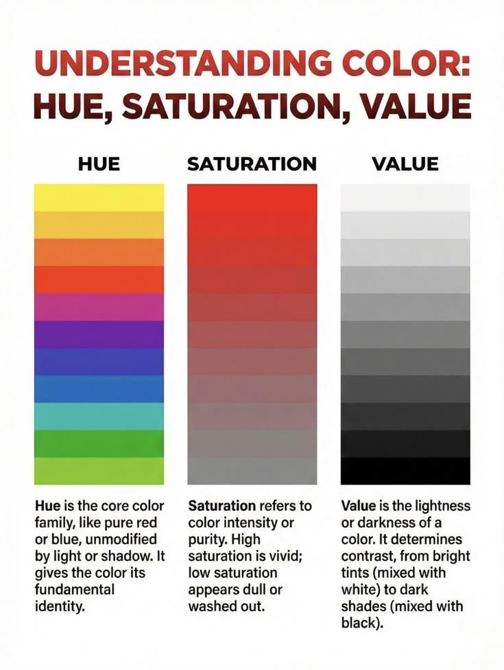
Knowing the color names is only the beginning. Two colors can have the same hue and look completely different because their saturation or lightness is different.
Hue
Hue is the basic color family you're looking at. Red is a hue. Blue is a hue. Green is a hue. When you move around the color wheel, you're changing the hue.
Saturation
Saturation describes how intense or muted a color appears. High saturation is bright, vivid and intense. Low saturation is muted, soft and grayish.
Compare a highly saturated red with a dusty rose. They're in the same general color family. But they create completely different visual impressions.
Lightness
Lightness describes how light or dark a color appears. The same hue can exist as very light, medium or dark. Changing lightness is one of the easiest ways to create hierarchy inside a palette.
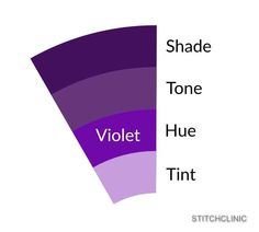
Tints, Shades and Tones
These three terms are often mixed up. They're different.
- ■Tint is created by adding white to a hue. Blue → lighter blue, red → pinkish red, purple → lavender.
- ■Shade is created by adding black. Blue → navy, red → burgundy, purple → deep violet.
- ■Tone is created by adding gray. This reduces the intensity of the original hue without simply making it lighter or darker.
Why this matters in design
These variations are extremely useful when you need multiple colors that still feel related. For example, instead of creating five completely unrelated greens, you can start with one green and generate: a light tint for backgrounds, the base color for buttons, a darker shade for text, and a muted tone for secondary elements.
This creates consistency without making everything identical.
Warm vs Cool Colors
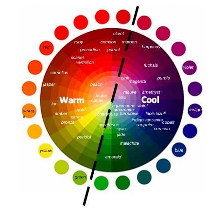
The color wheel can also be divided into warm and cool regions.
- ■Warm colors generally include reds, oranges and yellows. They can feel energetic, active or inviting.
- ■Cool colors generally include greens, blues and purples. They can feel calm, stable or distant.
But don't treat those associations as universal rules. A color's effect depends on saturation, lightness, surrounding colors, context, typography, imagery, industry and culture.
Even within the same hue, temperature can shift. A yellow-green can feel cooler than a warm golden yellow. A blue with a purple bias can feel warmer than a blue with a cyan bias.
Color Psychology: What Do Colors Actually Mean?
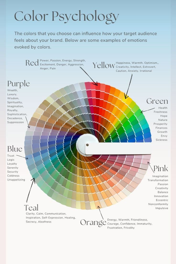
You've probably heard statements like: blue means trust, red means passion, green means growth.
These can be useful starting points. They're also too simplistic. Color meaning depends heavily on context.
A bright red button can communicate urgency. A deep burgundy can communicate luxury. A pale red can feel soft or romantic. The hue stayed within the same broad family. The experience changed because the shade, saturation, context and surrounding design changed.
Here are some common associations:
| Color | Common associations |
|---|---|
| Red | Energy, urgency, passion, danger |
| Orange | Warmth, enthusiasm, friendliness |
| Yellow | Optimism, attention, energy |
| Green | Nature, growth, health, money |
| Blue | Stability, calm, reliability |
| Purple | Creativity, luxury, imagination |
| Pink | Playfulness, softness, romance |
| Black | Sophistication, power, seriousness |
| White | Simplicity, cleanliness, openness |
| Brown | Earthiness, warmth, reliability |
Use these as design considerations, not psychological laws.
How to Choose Colors That Actually Work Together
This is where color theory becomes practical. You can follow every color-wheel rule and still create a bad palette. Why? Because good color design involves more than hue. Here are the principles that matter most.
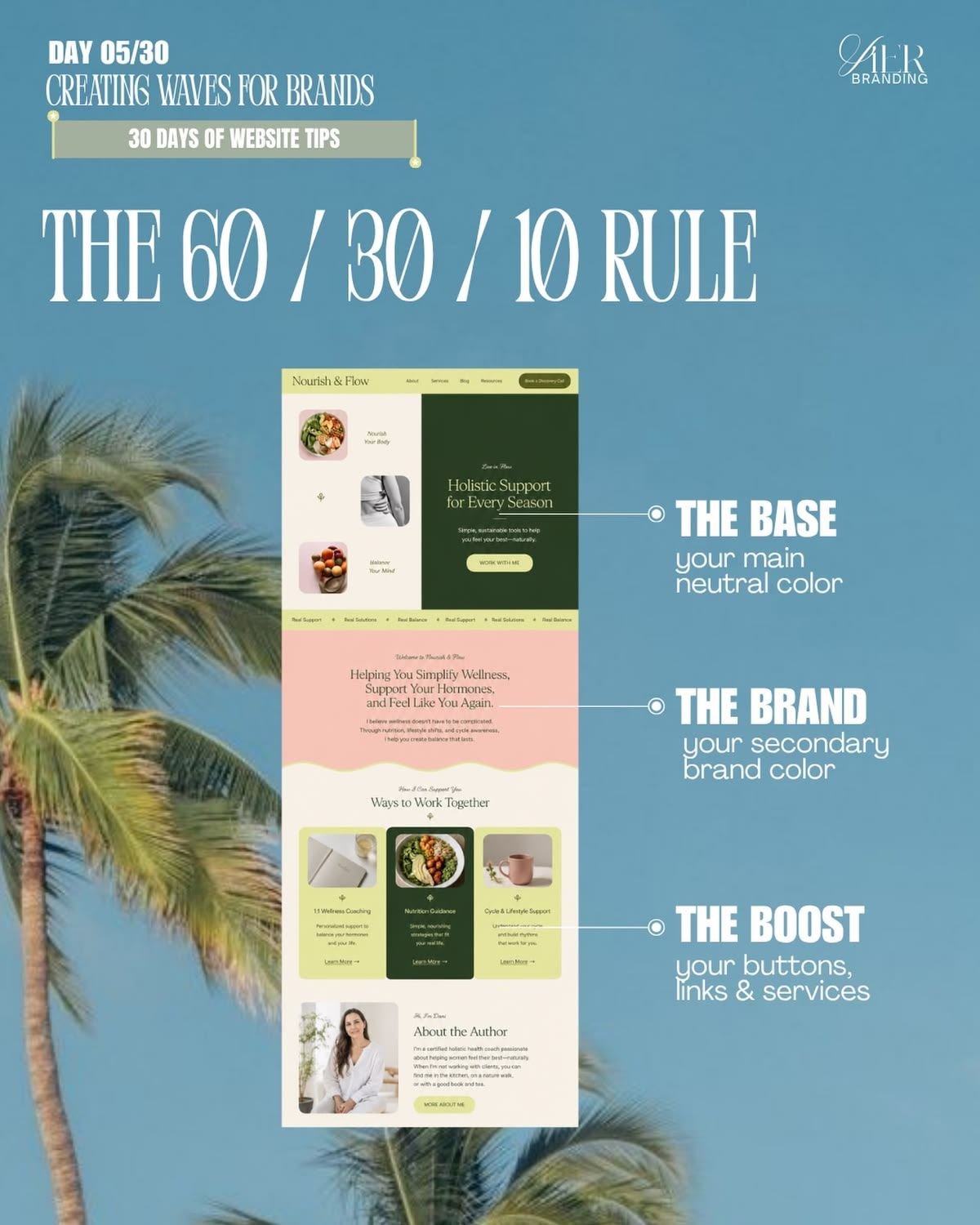
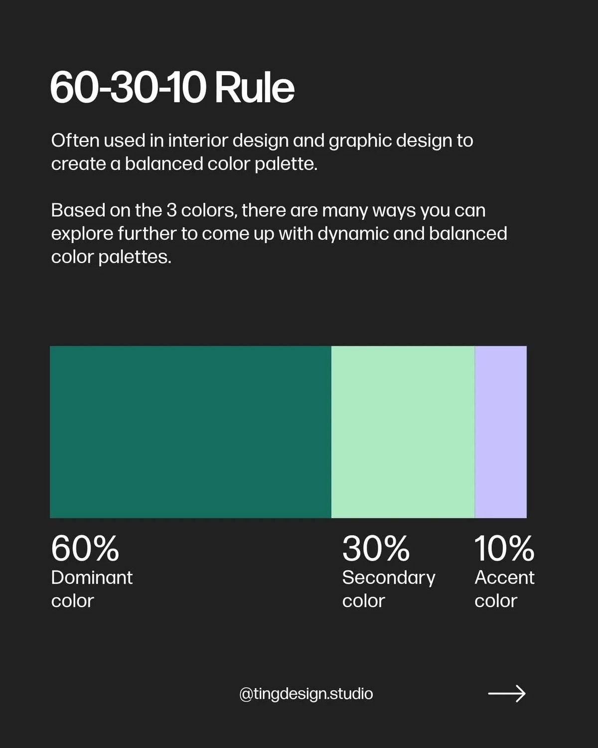
The 60-30-10 Rule
You've probably seen the 60-30-10 rule in interior design and visual design. The idea is simple: 60% dominant color, 30% secondary color, 10% accent color.
For example: 60% off-white, 30% dark navy, 10% orange. This gives the design a hierarchy.
The rule is useful as a starting point. It is not a law. A dashboard, poster, illustration and website may all need different proportions. The important lesson is: don't make every color equally loud.
Color Contrast: The Part You Can't Ignore
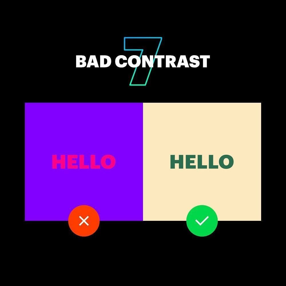
A color palette can look beautiful and still be difficult to use. The biggest example is text. Imagine light gray text on a white background. It might look elegant. It might also be difficult to read.
This is why accessibility needs to be part of your color process.
Under WCAG 2.2, normal text generally needs a contrast ratio of at least 4.5:1 for Level AA, while large text needs at least 3:1. WCAG also requires that color not be the only visual means used to communicate information. For enhanced Level AAA contrast, the thresholds are 7:1 for normal text and 4.5:1 for large text.
This matters for website text, buttons, forms, navigation, charts, icons, status indicators, focus states and data visualizations.
Don't rely on color alone
Imagine a dashboard where green = successful and red = failed. Someone with color-vision deficiency may struggle to distinguish them.
Add another signal: icons, labels, patterns, shapes, text, position. That way, the information doesn't depend entirely on color.
Color Blindness and Color-Safe Design
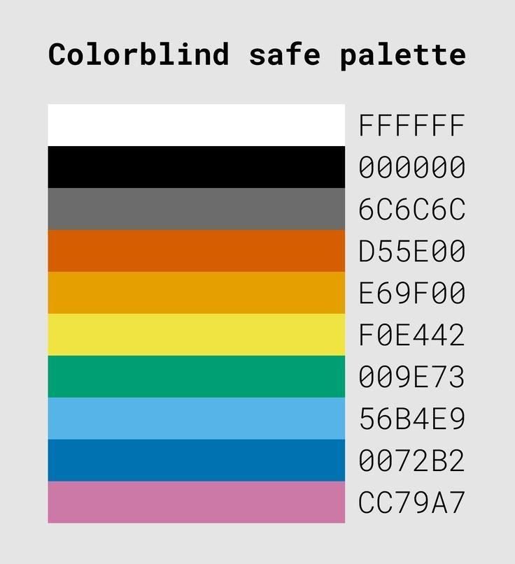
Designing for color vision differences doesn't mean making your designs boring. It means making sure important information remains understandable.
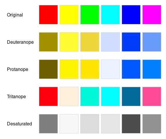
Common types of color vision deficiency include forms of red-green and blue-yellow confusion. Adobe's color accessibility tools, for example, simulate conditions such as protanopia, deuteranopia and tritanopia so designers can test palettes before using them.
A simple test: remove color from your design. Can someone still understand what the button does, which item is selected, which chart is increasing, which field has an error, and which status is important? If the answer is no, your design may be relying too heavily on color.
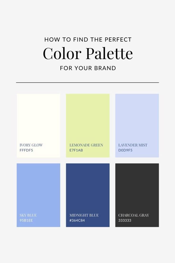
How to Create a Brand Color Palette
A brand palette needs to survive more than one design. Your colors might appear on a website, social media, presentations, ads, business cards, product interfaces, documents, email and merchandise.
So don't choose five pretty colors and call it a brand system. Build roles.
Color Palettes for Different Design Styles
There isn't one "best" color palette. The right palette depends on what you're designing.
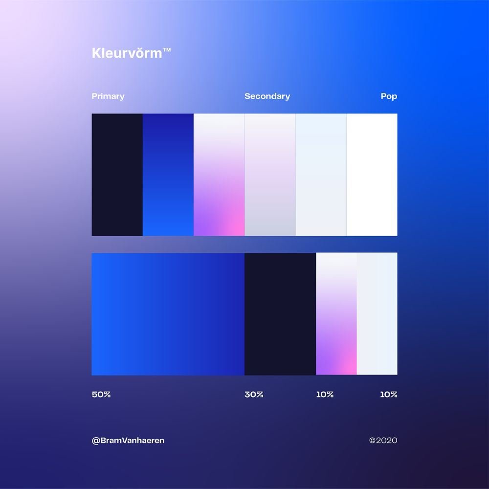
SaaS and technology
- ■Deep blue + electric accent
- ■Navy + cyan
- ■Purple + neutral
- ■Teal + dark charcoal
The important part is hierarchy. Your interface may need dozens of functional colors even if the brand only has three core colors.
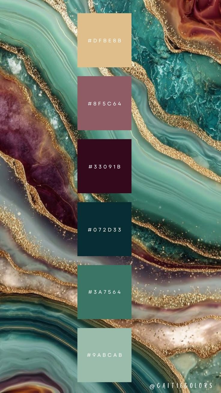
Luxury
- ■Black + cream
- ■Deep green + gold
- ■Burgundy + ivory
- ■Navy + champagne
Avoid making every element metallic or highly saturated. Luxury often relies heavily on restraint.
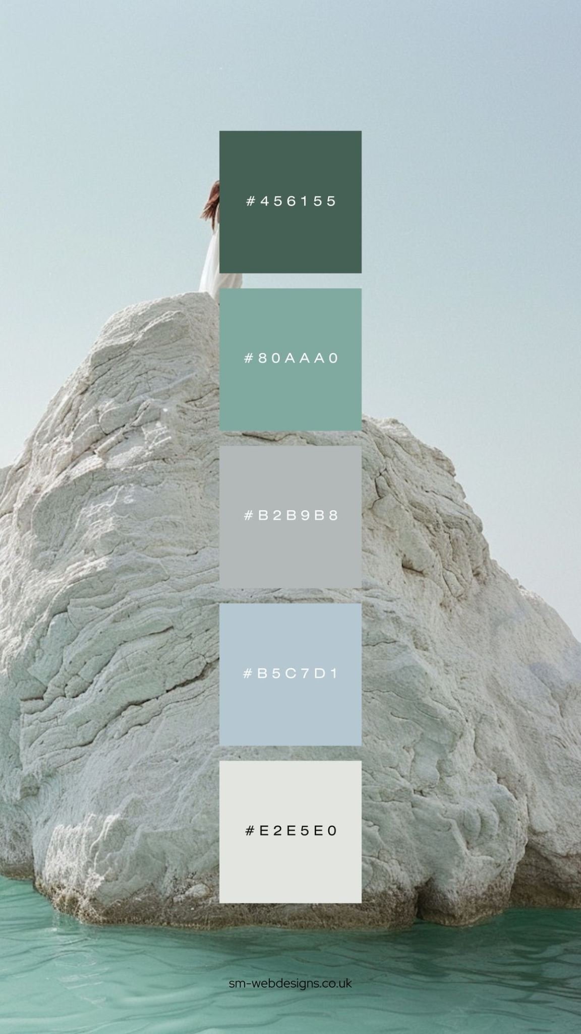
Wellness
- ■Sage + cream
- ■Soft green + warm beige
- ■Dusty blue + off-white
- ■Terracotta + sand
Muted colors can create a softer visual language.
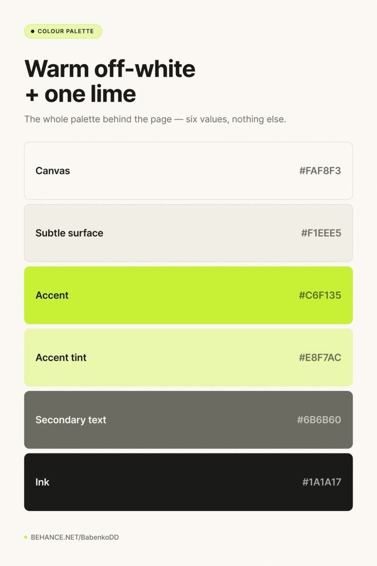
E-commerce
- ■Strong neutral backgrounds
- ■One recognizable brand color
- ■A high-contrast CTA
- ■Clear sale or promotional colors
Don't let the interface compete with the products.
Personal brands
- ■One distinctive primary color
- ■One accent
- ■A strong neutral system
The goal is recognizability without forcing every piece of content into the same five colors.
How Many Colors Should a Color Palette Have?
There is no universal number.
A small brand palette might have 1 primary, 1 secondary, 1 accent and 3–5 neutrals. A product design system may have dozens or hundreds of color tokens because colors are needed for different states and components. A social graphic may only need three.
The question isn't "how many colors should I use?" The better question is "how many colors does this design need to communicate what it needs to communicate?"
More colors do not automatically create a better design.
Common Color Theory Mistakes
✕ 1. Choosing colors only because they're harmonious
A complementary palette can still look terrible. Harmony is a relationship. Design quality depends on execution.
✕ 2. Using every color at full saturation
This creates competition. Mute supporting colors. Save intensity for the places that need attention.
✕ 3. Giving every color equal importance
Your viewer needs hierarchy. One color should usually lead.
✕ 4. Ignoring contrast
A beautiful palette that makes text difficult to read is not a successful palette.
✕ 5. Using color psychology as a rigid formula
"Blue means trust" is not a design strategy. Context matters.
✕ 6. Picking colors before deciding how they'll be used
A color might look beautiful as a background and terrible as body text. Test it.
✕ 7. Forgetting neutrals
Neutrals give colorful elements room to breathe.
✕ 8. Using color as the only signal
Especially in interfaces, charts and dashboards, pair color with labels, icons or other visual cues.
✕ 9. Designing only for light mode
If you're building a digital product, check how your palette behaves against both light and dark surfaces.
✕ 10. Judging colors only as swatches
The final test is always the same: put the colors into the thing you're actually designing.
How to Use a Color Wheel to Build a Palette
Here's a simple process you can use for almost any design project.
Color Wheel Cheat Sheet
Need the quick version?
Complementary
Opposite colors
Best for: High contrast and strong accents.
Monochromatic
One hue, different variations
Best for: Simple and cohesive designs.
Analogous
Neighboring colors
Best for: Smooth, unified palettes.
Split-complementary
Base + two colors near its opposite
Best for: Contrast with more flexibility.
Triadic
Three evenly spaced colors
Best for: Bold, colorful designs.
Tetradic
Two complementary pairs
Best for: Complex palettes with strong hierarchy.
| Term | Meaning |
|---|---|
| Tint | Hue + white |
| Shade | Hue + black |
| Tone | Hue + gray |
| Hue | The color family |
| Saturation | How intense or muted the color is |
| Lightness | How light or dark it appears |