
The 25 Best Shades of Dark Green (+ HEX Codes)
Dark green is the color equivalent of a well-tailored blazer: quiet, confident, and never trying too hard. It's the shade behind British racing cars, Ivy League crests, national flags, and half the "trustworthy fintech" logos launched in the last decade.
But "dark green" isn't one color. It's a whole family, and picking the wrong member of that family is how a "sophisticated forest" brand ends up looking like a "military surplus" brand instead.
This guide goes deeper than a simple swatch list. For all 25 classic shades of dark green, you'll get the HEX code, RGB value, CMYK breakdown, and WCAG contrast ratios against both white and black text — the numbers you actually need when you're building a real design, not just admiring a color chip. We've also added 5 bonus shades, a full color-psychology section, pairing palettes, and a practical framework for choosing the right green for infographics, branding, and web design.
Quick-Reference Table
Bookmark this. Every value below is calculated directly from the HEX code, so the contrast ratios are exact, not estimated.
| # | Shade | HEX | RGB | CMYK | vs White | vs Black |
|---|---|---|---|---|---|---|
| 1 | Rich Black | #010203 | 1, 2, 3 | 67, 33, 0, 99 | 20.77 | 1.01 |
| 2 | Tropical Rain Forest | #00755E | 0, 117, 94 | 100, 0, 20, 54 | 5.67 | 3.71 |
| 3 | Islamic Green | #009000 | 0, 144, 0 | 100, 0, 100, 44 | 4.21 | 4.99 |
| 4 | Pine Green | #01796F | 1, 121, 111 | 99, 0, 8, 53 | 5.30 | 3.97 |
| 5 | British Racing Green | #004225 | 0, 66, 37 | 100, 0, 44, 74 | 11.63 | 1.81 |
| 6 | Cal Poly Pomona Green | #1E4D2B | 30, 77, 43 | 61, 0, 44, 70 | 9.76 | 2.15 |
| 7 | Pakistan Green | #006600 | 0, 102, 0 | 100, 0, 100, 60 | 7.24 | 2.90 |
| 8 | Skobeloff | #007474 | 0, 116, 116 | 100, 0, 0, 55 | 5.60 | 3.75 |
| 9 | Myrtle | #21421E | 33, 66, 30 | 50, 0, 55, 74 | 11.27 | 1.86 |
| 10 | Sacramento State Green | #043927 | 4, 57, 39 | 93, 0, 32, 78 | 12.97 | 1.62 |
| 11 | Cadmium Green | #006B3C | 0, 107, 60 | 100, 0, 44, 58 | 6.63 | 3.17 |
| 12 | Lincoln Green | #195905 | 25, 89, 5 | 72, 0, 94, 65 | 8.49 | 2.47 |
| 13 | La Salle Green | #087830 | 8, 120, 48 | 93, 0, 60, 53 | 5.62 | 3.74 |
| 14 | Viridian | #40826D | 64, 130, 109 | 51, 0, 16, 49 | 4.53 | 4.63 |
| 15 | MSU Green | #18453B | 24, 69, 59 | 65, 0, 14, 73 | 10.75 | 1.95 |
| 16 | Hunter Green | #355E3B | 53, 94, 59 | 44, 0, 37, 63 | 7.46 | 2.82 |
| 17 | Dark Jungle Green | #1A2421 | 26, 36, 33 | 28, 0, 8, 86 | 15.93 | 1.32 |
| 18 | Deep Jungle Green | #004B49 | 0, 75, 73 | 100, 0, 3, 71 | 9.99 | 2.10 |
| 19 | Teal Green | #00827F | 0, 130, 127 | 100, 0, 2, 49 | 4.67 | 4.50 |
| 20 | Bottle Green | #006A4E | 0, 106, 78 | 100, 0, 26, 58 | 6.62 | 3.17 |
| 21 | Office Green | #008000 | 0, 128, 0 | 100, 0, 100, 50 | 5.14 | 4.09 |
| 22 | Shamrock Green | #009E60 | 0, 158, 96 | 100, 0, 39, 38 | 3.47 | 6.06 |
| 23 | Dartmouth Green | #00693E | 0, 105, 62 | 100, 0, 41, 59 | 6.80 | 3.09 |
| 24 | Army Green | #4B5320 | 75, 83, 32 | 10, 0, 61, 67 | 8.21 | 2.56 |
| 25 | Fern Green | #4F7942 | 79, 121, 66 | 35, 0, 45, 53 | 5.07 | 4.15 |
#1
Rich Black
#010203
#2
Tropical Rain Forest
#00755E
#3
Islamic Green
#009000
#4
Pine Green
#01796F
#5
British Racing Green
#004225
#6
Cal Poly Pomona Green
#1E4D2B
#7
Pakistan Green
#006600
#8
Skobeloff
#007474
#9
Myrtle
#21421E
#10
Sacramento State Green
#043927
#11
Cadmium Green
#006B3C
#12
Lincoln Green
#195905
#13
La Salle Green
#087830
#14
Viridian
#40826D
#15
MSU Green
#18453B
#16
Hunter Green
#355E3B
#17
Dark Jungle Green
#1A2421
#18
Deep Jungle Green
#004B49
#19
Teal Green
#00827F
#20
Bottle Green
#006A4E
#21
Office Green
#008000
#22
Shamrock Green
#009E60
#23
Dartmouth Green
#00693E
#24
Army Green
#4B5320
#25
Fern Green
#4F7942
Why contrast ratios matter: WCAG 2.1 requires a ratio of at least 4.5:1 for normal body text and 3:1 for large text/graphics to be considered accessible. Look at the table again. Shamrock Green and Emerald-family greens fail against white at body-text sizes, while Rich Black, Dark Jungle Green, and British Racing Green pass comfortably against white with huge margins to spare. This is the single most common mistake in green-heavy branding: picking a shade that looks great in a mockup and then fails accessibility once real text sits on top of it.
The 25 Shades in Detail
1) Rich Black
HEX #010203 · RGB 1, 2, 3 · CMYK 67, 33, 0, 99
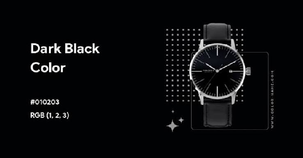
Rich Black isn't pure black. It carries a faint green undertone that keeps it from looking flat or 'printer-default.' Designers use true rich black formulas (rather than a plain 0,0,0 K-only black) specifically because it prints with more density and depth. Against white text it hits a contrast ratio of 20.77, essentially maximum legibility, which makes it the safest possible background for dense infographic text, data tables, or slide decks where readability can't be compromised.
Best for: infographic backgrounds, dashboards, premium packaging, dark-mode UI
2) Tropical Rain Forest
HEX #00755E · RGB 0, 117, 94 · CMYK 100, 0, 20, 54
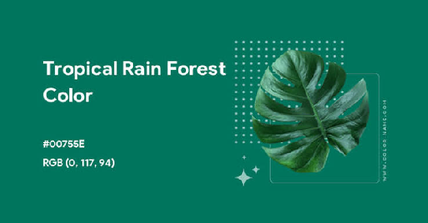
A blue-leaning green with real saturation. It reads as lush and humid rather than muted or dusty. It sits right at the edge of AA-accessible against white (5.67), so it's safe for headlines and large UI elements but should be paired with white text rather than the reverse for body copy.
Best for: eco/sustainability brands, section headers, nature and travel content
3) Islamic Green
HEX #009000 · RGB 0, 144, 0 · CMYK 100, 0, 100, 44

A pure, saturated green with no blue or gray dulling it down, historically significant in flags and religious iconography, and visually one of the 'loudest' greens on this list. Its contrast against white (4.21) sits just under the AA body-text threshold, so reserve it for accents, icons, and large text rather than paragraphs.
Best for: call-to-action accents, icon systems, flag/heritage-themed content
4) Pine Green
HEX #01796F · RGB 1, 121, 111 · CMYK 99, 0, 8, 53
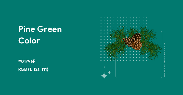
Cool, blue-shifted, and calm, Pine Green is the 'spa lobby' of the dark green family. It's one of the more balanced shades on the list for pairing with both light and dark text depending on size, with a 5.30 ratio against white.
Best for: wellness apps, calming dashboard themes, presentation backgrounds
5) British Racing Green
HEX #004225 · RGB 0, 66, 37 · CMYK 100, 0, 44, 74

The color of Aston Martins, Bentleys, and old-money tailoring. It's dark enough (11.63 contrast against white) to function almost like a black in UI design while still reading unmistakably as green, giving you the 'premium and serious' signal of black with more warmth and brand personality.
Best for: luxury branding, automotive, whisky/spirits labels, financial services
6) Cal Poly Pomona Green
HEX #1E4D2B · RGB 30, 77, 43 · CMYK 61, 0, 44, 70

An institutional green with real depth, the kind of shade you see on university seals and academic letterheads. A 9.76 contrast ratio against white makes it excellent for body text on a light background.
Best for: education platforms, certificates, academic branding
7) Pakistan Green
HEX #006600 · RGB 0, 102, 0 · CMYK 100, 0, 100, 60
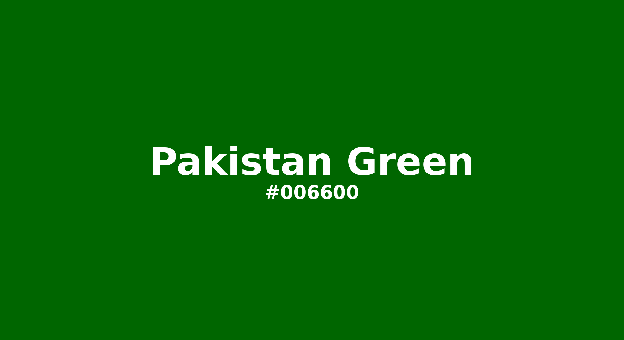
Deep and unmistakably green, with no undertone pretending to be something else. Contrast of 7.24 against white makes it a strong, safe choice for text and iconography alike.
Best for: national/civic branding, agriculture and farming content, bold accent blocks
8) Skobeloff
HEX #007474 · RGB 0, 116, 116 · CMYK 100, 0, 0, 55
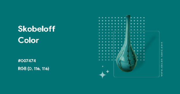
A true green-blue midpoint, teal's more serious cousin. At 5.60 contrast against white, it works well for buttons and interactive elements that need to feel calm but still draw the eye.
Best for: SaaS dashboards, fintech accents, call-to-action buttons
9) Myrtle
HEX #21421E · RGB 33, 66, 30 · CMYK 50, 0, 55, 74

Muted, mossy, and quiet... Myrtle reads as understated rather than vibrant. Its 11.27 contrast ratio against white makes it a dependable body-text or headline color on light backgrounds.
Best for: editorial design, corporate reports, understated brand backgrounds
10) Sacramento State Green
HEX #043927 · RGB 4, 57, 39 · CMYK 93, 0, 32, 78
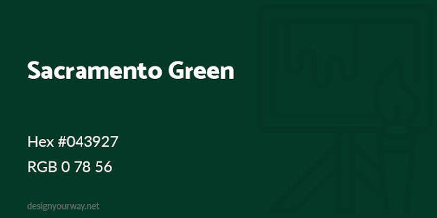
One of the darkest true greens on this list, with a striking 12.97 contrast ratio against white, nearly as legible as black. It's an excellent near-black substitute when you want depth without losing 'green' as part of the brand story.
Best for: collegiate branding, premium dark-mode interfaces, formal documents
11) Cadmium Green
HEX #006B3C · RGB 0, 107, 60 · CMYK 100, 0, 44, 58
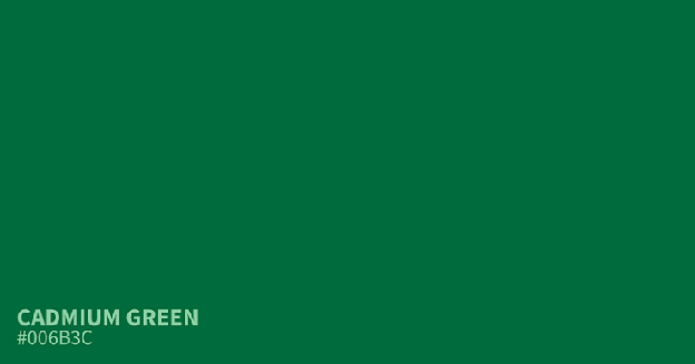
A slightly warmer, more saturated green than Bottle Green or Dartmouth Green, with a yellow lean that keeps it feeling energetic instead of somber. Contrast of 6.63 against white keeps it safely legible.
Best for: highlight blocks in infographics, energetic eco-branding, badges
12) Lincoln Green
HEX #195905 · RGB 25, 89, 5 · CMYK 72, 0, 94, 65
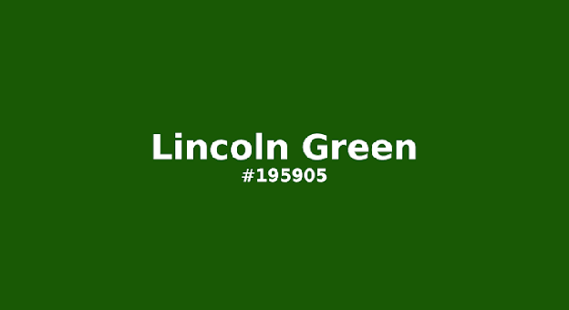
Named for the woodland cloth of English folklore (Robin Hood green), this shade leans earthy and yellow-warm. An 8.49 contrast against white makes it a solid, legible choice for text-heavy layouts with a historical or heritage feel.
Best for: heritage branding, storybook/editorial illustration, outdoor apparel
13) La Salle Green
HEX #087830 · RGB 8, 120, 48 · CMYK 93, 0, 60, 53
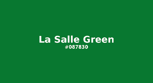
Bright and energetic without tipping into neon, a strong candidate for sports branding where you want a green that reads as 'team color' from a distance. Contrast of 5.62 against white is solidly AA-compliant.
Best for: sports logos, merchandise, energetic CTAs
14) Viridian
HEX #40826D · RGB 64, 130, 109 · CMYK 51, 0, 16, 49

A softer, more desaturated green that reads as sophisticated rather than bold, this is the shade artists reach for in oil paint because of how well it sits between blue and green. Its contrast values (4.53 white / 4.63 black) are nearly balanced, meaning it works reasonably well with either light or dark text, which is rare for a single shade.
Best for: editorial illustration, muted brand palettes, background wash colors
15) MSU Green
HEX #18453B · RGB 24, 69, 59 · CMYK 65, 0, 14, 73
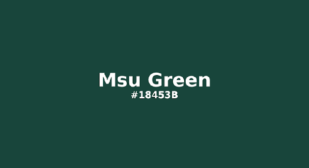
A dense, blue-shifted forest green used widely in university branding. A 10.75 contrast ratio against white puts it firmly in 'safe for body text' territory.
Best for: university/academic branding, formal reports, dark UI panels
16) Hunter Green
HEX #355E3B · RGB 53, 94, 59 · CMYK 44, 0, 37, 63
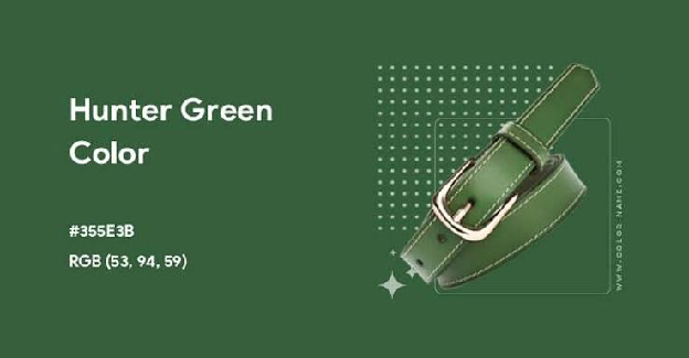
Possibly the most iconic 'dark green' of them all, the shade of hunting jackets, preppy fashion, and classic Land Rovers. Balanced and neutral, it pairs cleanly with cream, tan, gold, and white. Contrast against white sits at 7.46.
Best for: outdoor and fashion branding, timeless logo work, packaging
17) Dark Jungle Green
HEX #1A2421 · RGB 26, 36, 33 · CMYK 28, 0, 8, 86
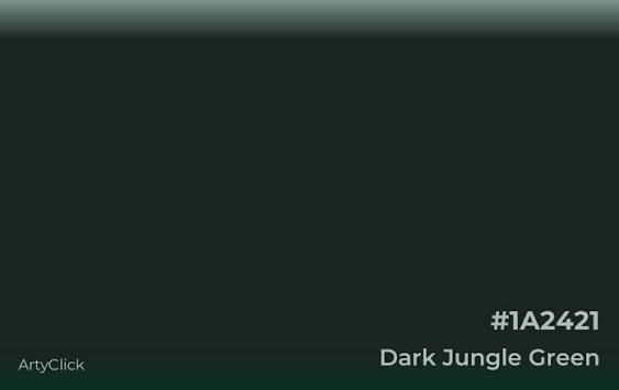
Nearly black with just enough green in it to feel intentional rather than default. At 15.93 contrast against white, it's one of the strongest performers on this list for text legibility, a genuine alternative to #000000 for anyone who wants 'black' with personality.
Best for: dark-mode app backgrounds, moody photography overlays, premium dashboards
18) Deep Jungle Green
HEX #004B49 · RGB 0, 75, 73 · CMYK 100, 0, 3, 71

Cooler and more teal-leaning than its jungle-green sibling, with a mysterious, almost aquatic quality. A 9.99 contrast ratio against white makes it dependable for text and UI chrome.
Best for: moody dashboards, nightlife/entertainment branding, dark hero sections
19) Teal Green
HEX #00827F · RGB 0, 130, 127 · CMYK 100, 0, 2, 49
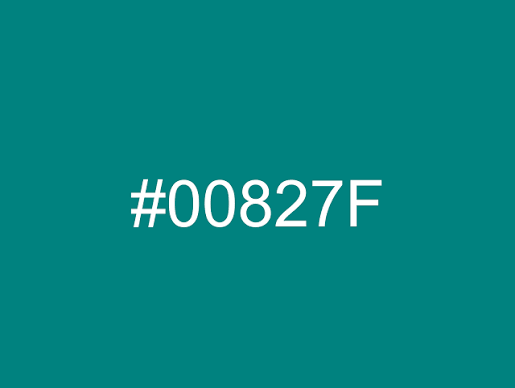
The most balanced blue-green on the list, sitting almost exactly between the two hues. Contrast values of 4.67 (white) and 4.50 (black) mean it's borderline for body text against either, use it for large text, buttons, and accents rather than fine print.
Best for: wellness branding, water/ocean themes, SaaS accent colors
20) Bottle Green
HEX #006A4E · RGB 0, 106, 78 · CMYK 100, 0, 26, 58
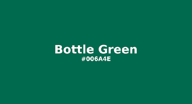
Named for old glass wine and beer bottles, this shade carries genuine vintage weight. A 6.62 contrast ratio against white keeps it comfortably legible.
Best for: wine/spirits branding, vintage packaging, luxury retail
21) Office Green
HEX #008000 · RGB 0, 128, 0 · CMYK 100, 0, 100, 50
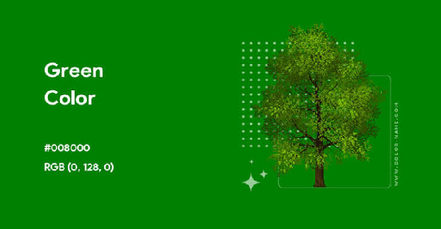
The 'default green,' literally the CSS/web-safe color named green. Familiar to the point of being almost invisible as a design choice, which can work for you (instant recognizability) or against you (zero brand distinction). Contrast against white: 5.14.
Best for: status indicators (success/complete states), basic charts, universally recognizable 'go' signals
22) Shamrock Green
HEX #009E60 · RGB 0, 158, 96 · CMYK 100, 0, 39, 38
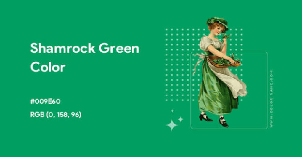
Bright, fresh, and unmistakably tied to Ireland and renewal themes. Note that its contrast against white is only 3.47, below the 4.5 threshold for body text, so pair it with black or very dark text, where it scores a strong 6.06.
Best for: seasonal campaigns, fresh/organic branding, icon accents on dark backgrounds
23) Dartmouth Green
HEX #00693E · RGB 0, 105, 62 · CMYK 100, 0, 41, 59
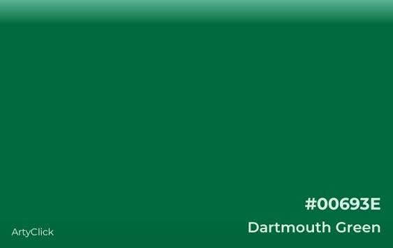
Another academic staple, slightly warmer and darker than MSU Green. A 6.80 contrast ratio against white makes it dependable for both text and larger design elements.
Best for: university branding, formal certificates, legal/professional services
24) Army Green
HEX #4B5320 · RGB 75, 83, 32 · CMYK 10, 0, 61, 67
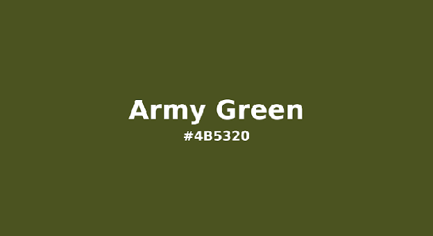
Muted, brown-leaning, and unmistakably utilitarian. This is the shade to use when you want 'rugged and durable' rather than 'elegant and refined.' Contrast against white: 8.21.
Best for: outdoor/tactical brands, workwear, industrial packaging
25) Fern Green
HEX #4F7942 · RGB 79, 121, 66 · CMYK 35, 0, 45, 53
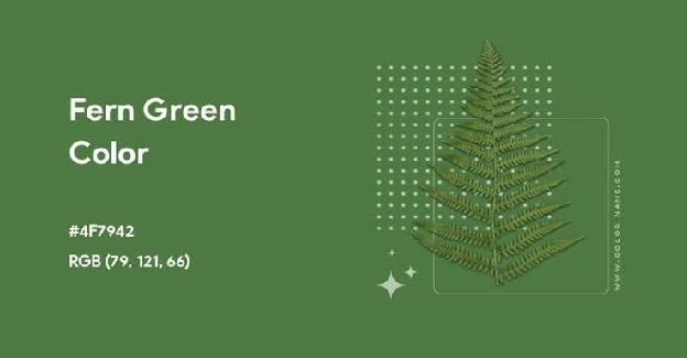
Warm, earthy, and yellow-leaning, the friendliest, most approachable green on this list. A 5.07 contrast ratio against white keeps it AA-safe for body text.
Best for: eco-friendly branding, food and wellness products, organic packaging
5 Bonus Shades
A "complete" guide to dark green shouldn't skip the five names people search for most. Here they are, with the same full data set:
| Shade | HEX | RGB | CMYK | vs White | vs Black |
|---|---|---|---|---|---|
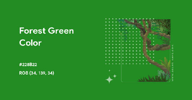
| Forest Green | #228B22 | 34, 139, 34 | 76, 0, 76, 45 | 4.39 | 4.78 |
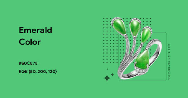
| Emerald | #50C878 | 80, 200, 120 | 60, 0, 40, 22 | 2.13 | 9.87 |
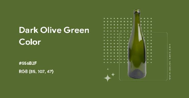
| Dark Olive Green | #556B2F | 85, 107, 47 | 21, 0, 56, 58 | 5.95 | 3.53 |
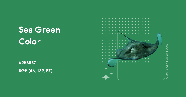
| Sea Green | #2E8B57 | 46, 139, 87 | 67, 0, 37, 45 | 4.25 | 4.95 |
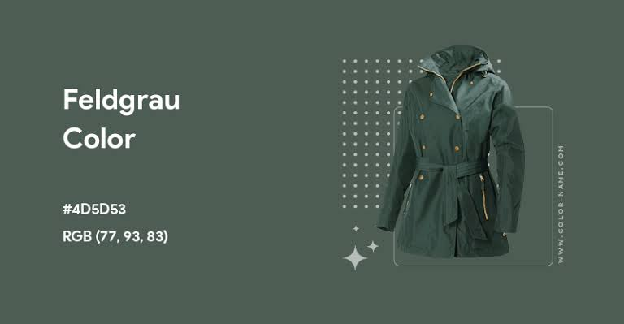
| Feldgrau | #4D5D53 | 77, 93, 83 | 17, 0, 11, 64 | 6.99 | 3.01 |
Forest Green
#228B22
RGB 34, 139, 34
CMYK 76, 0, 76, 45
Emerald
#50C878
RGB 80, 200, 120
CMYK 60, 0, 40, 22
Dark Olive Green
#556B2F
RGB 85, 107, 47
CMYK 21, 0, 56, 58
Sea Green
#2E8B57
RGB 46, 139, 87
CMYK 67, 0, 37, 45
Feldgrau
#4D5D53
RGB 77, 93, 83
CMYK 17, 0, 11, 64
Forest Green is the shade most people picture when they hear "dark green" — it's the generalist of the family, safe for almost any nature or growth-themed brand.
Emerald is technically a mid-tone rather than a true dark shade (its 2.13 contrast against white confirms it needs dark text, not light), but it's requested constantly for luxury and jewelry-adjacent branding.
Dark Olive Green and Feldgrau (German military gray-green) are the two most useful "muted, sophisticated" options if Hunter Green feels too obvious.
Sea Green bridges the gap between Viridian and Forest Green — a dependable mid-dark green for anything ocean- or nature-adjacent.
The Psychology of Dark Green
Green sits at the center of the color wheel, and dark green inherits green's core associations (growth, nature, health, stability, wealth) while trading the brightness of lighter greens for something heavier and more serious.
- ■Blue-leaning dark greens (Pine Green, Skobeloff, Teal Green, MSU Green) read as calm, professional, and clinical — useful anywhere you need to feel trustworthy without being cold.
- ■Yellow-leaning dark greens (Fern Green, Army Green, Lincoln Green, Dark Olive Green) read as earthy, organic, and rugged — useful for anything positioned as natural, sustainable, or outdoorsy.
- ■Near-black dark greens (Rich Black, Dark Jungle Green, Sacramento State Green) borrow black's authority and weight while keeping a hint of warmth that pure black lacks — a genuinely underused move in premium branding.
Money and wealth associations are also worth naming directly: dark green is the color of paper currency in more countries than any other single hue, which is part of why banks, investment platforms, and luxury goods brands reach for it so often.
If your brand wants to signal "established and secure" rather than "fast-growing startup," a dark, desaturated green will do more of that work than almost any other color choice.
How to Actually Use These Shades (Not Just Look at Them)
In branding and logo design
Pick one anchor shade and build the rest of your palette around its undertone, not its darkness. Mixing a blue-leaning dark green (like Pine Green) with a yellow-leaning one (like Fern Green) in the same logo usually looks like a mistake rather than a choice — the eye reads the clash even if it can't name it.
Some examples are Sprite and Spotify:

In web and product design
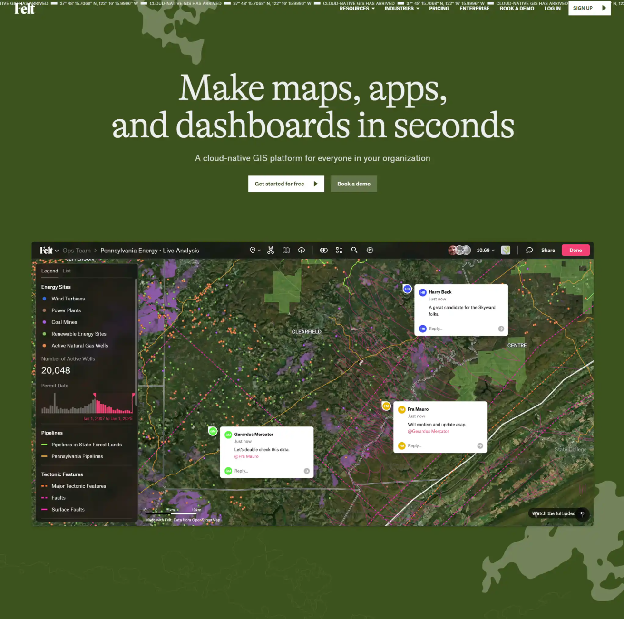
Check contrast before you commit. A shade that looks perfectly readable on your monitor at 100% zoom can fail WCAG AA the moment it's used for real body text at 14px. Use the contrast numbers above as a first filter, then verify final combinations with a contrast checker on your actual rendered UI.
bambukstudio.com
In infographics and presentations
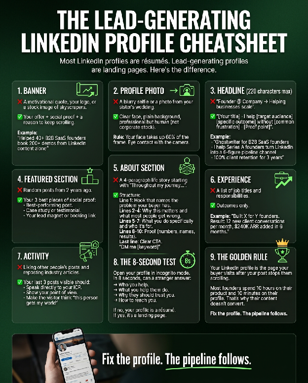
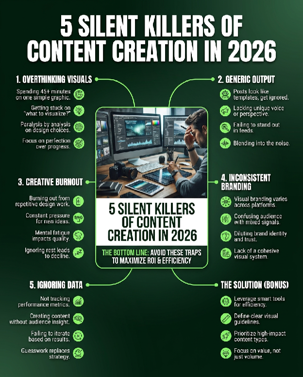
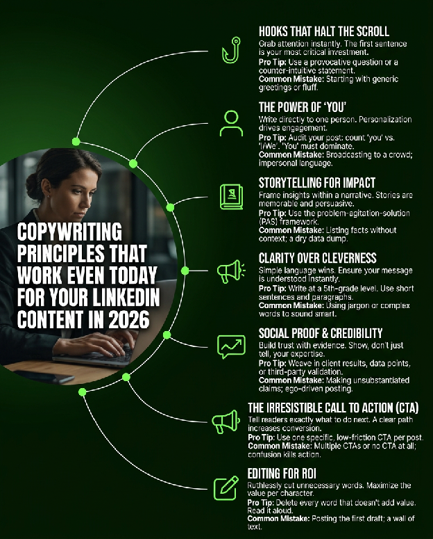
Dark greens make excellent background colors precisely because of their high contrast against white text (see the Rich Black, Dark Jungle Green, and Sacramento State Green numbers above), but they make poor body text colors on white backgrounds unless the contrast ratio clears 4.5. This is the single most common readability mistake in DIY infographics: gorgeous dark green headline, illegible dark green paragraph underneath it.
In interior design
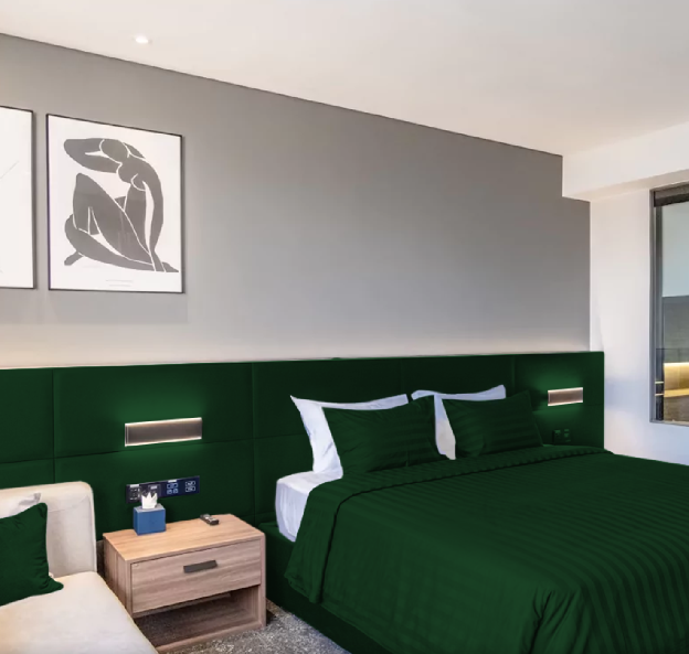
Because dark green reads as both grounding and rich, it pairs exceptionally well with warm woods, brass, and cream — British Racing Green and Hunter Green in particular are having a long moment in kitchen cabinetry and built-in furniture for exactly this reason.
Pairing Palettes That Actually Work
Modern & minimal
Dark Jungle Green + off-white (#F5F3EE) + a single warm accent (terracotta or brass)
Luxury & heritage
British Racing Green + cream + gold foil accents
Eco & sustainability
Fern Green + Sea Green + a warm neutral (oat, sand)
Fintech & SaaS
Skobeloff + Rich Black + a single bright accent (lime or white) for CTAs
Academic & institutional
MSU Green or Dartmouth Green + white + a muted gold
Frequently Asked Questions
What's the darkest shade of green?
Among true greens (not near-blacks), Sacramento State Green (#043927) and Dark Jungle Green (#1A2421) are among the darkest, with contrast ratios against white above 12, nearly matching pure black for legibility.
Is dark green good for a logo?
Yes, it's one of the most trusted colors in branding, associated with stability, growth, and wealth. Just match the undertone (blue-leaning vs. yellow-leaning) to your brand's personality, and check text contrast if the color will sit behind a wordmark.
What colors pair well with dark green?
Cream, warm white, brass/gold, tan, and terracotta pair especially well, since they lean warm against green's coolness. For a punchier look, pair dark green with a single bright accent like lime, coral, or mustard.
Does dark green work for dark mode UI?
Very well. Shades like Dark Jungle Green and Rich Black work as near-black backgrounds with more personality than pure black, while brighter greens like Skobeloff or Teal Green work well as accent colors on top of them.
Turn Any of These Shades Into a Finished Design in Seconds
Knowing the perfect HEX code is only half the job. The other half is actually building something with it. If you're creating LinkedIn content, Visly turns a single sentence into a polished, on-brand infographic in under 60 seconds. Set your brand's dark green (and its exact HEX code) once, and every infographic you generate after that comes out on-brand automatically — no Canva templates to wrestle with, no designer invoice, no revision loop.